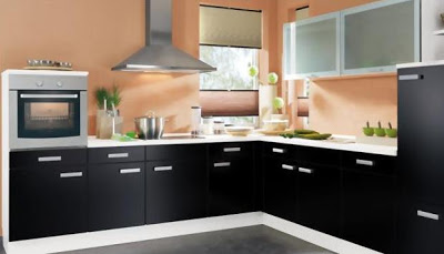
Other article referred to how to choose the color of the kitchen answering a few simple questions. The variety of tones is very extensive, so there for all tastes and styles. I now present a series of photographs in Orange, exclusively of kitchens. Different shades of a color, which create different environments according to their brightness, lighting and furniture of the place.
In the first case we see a hue of Orange, not very intense, which we can call it orange pumpkin. This combined with very soft cream furniture making an harmonious and comfortable interior. You have good lighting to show off all its charm is the ideal for the Orange.
Another pumpkin interior with details on frames and baseboards white, essential to define and differentiate it from the wooden floor. Steel furniture create an atmosphere much more modern and functional in the previous case, but the Orange brings warmth to the environment.
Now, the tone varies to something similar to a peach or coral. Combined with modern furniture in high-contrast black and white. It maintains a balance between the modern and the warm of the home.
A strong Orange tone as the previous image can give a twist in a rustic and small kitchen. Combined with natural wood and bone.
And as we see in vivid color to paint the walls, it is important that this Orange carrot is accompanied of a neutral tone as the white broken or grey ice. Latter are perfectly intense tone, create space and provide lighting.
There is no doubt that the Orange was an emblematic color in the design of the 1970s, so include it in furniture and accessories or objects of daily use could create environments retro or vintage.
And in the latter case, the tile. Earthy, more off orange hue but that may look very attractive to those who do not wish to so brightly in the interior. In this example you can see a corner of an environment, in which color to create a special section in a white interior.


0 comments:
Post a Comment